Comic Sans


.avif)


Comic Sans
You started to write a blog, just like this one, and realized that you need inspiration. So rather than going to Chat GPT or whatever robot you prefer to do your work for you, you start scrolliung through fonts. Suddenly you land on something familiar. Something that reminds you of a different time…something with deep whimsy. You click on Comic Sans and you blitz your way through a 10 000 word epic. Way to go.
When you think of ‘easy to rip-on’ fonts, Comic Sans is the first that comes to mind. It is often ridiculed, dismissed, or outright hated by the design community, and in popular culture. However, its story is much deeper than just a "bad design choice"—and today, we’re going to dig into its origins and why it’s not quite the villain it’s often made out to be.

Comic Sans: The Origin Story
Comic Sans wasn’t designed with the intent of becoming a meme or the punchline of a thousand jokes. Created in 1995 by Vincent Connare, a Microsoft designer, the font was inspired by comic books, which Vincent felt made reading more youthful and fun.
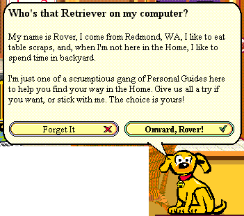
At the time, Microsoft was working on a project called Microsoft Bob, a software intended to mimic the home environment. You Gen Z’ers reading this will cringe, but computers used to be fairly difficult to use and did not have a friendly home screen to interact with. Microsoft was on to something… they just chose an odd execution plan. Within this "home," there was a cartoon dog named Rover, whose speech balloons needed to look casual and approachable. As a result, Connare chose a font that mimicked comic book fonts. And thought a sanserif font would be superior in this case (Sanserif > Serif). Thus, Comic-Sans was born.

The Role of Comic Sans in Digital Communication
After Rover and Microsoft Bob were taken down with brute force, Comic Sans found an unexpected life outside of that universe. The font was included in the Windows 95 operating system, and quickly became popular for everything from school newsletters to birthday invitations and, yes, even websites.
Fun fact: I remember being very proud of submitting writing projects from Grade 5-7 with this exact font. It helped get me through school- it was the only way.
Comic Sans: Why So Much Hate?
Despite its widespread usage, Comic Sans has become the subject of much hate in the design community. But this is not the fault of Comic Sans. This is the fault of corporate middle managers who wanted to make their professional presentations more inviting. After all, a PowerPoint in Times New Roman would send the wrong message to investors…Comic Sans, on the other hand, would create a space for laughter and friendship.
Jokes aside, this font was intended for child-friendly communications and not to be a powerhouse corporate font. Ultimately, it’s the misuse of Comic Sans that drives its ridicule.
The Characteristics of Comic Sans
Let’s break down the unique features of Comic Sans, so we can appreciate it for what it is:
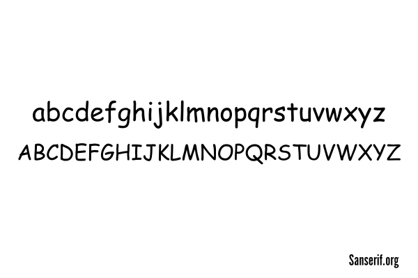
- Casual and Playful: Rounded, playful letterforms that mimic hand-drawn comic book text.
- Wide Letter Spacing: The font’s generous letter spacing contributes to its friendly and open feel.
- Irregular Letterforms: While some may see this as a flaw, the slightly uneven shapes of Comic Sans are what make it stand out.

So… Why Comic Sans?
Just as Montserrat has its origins rooted in a Buenos Aires neighborhood, Comic Sans has its own roots in the digital age and was born out of a desire for friendly communicationThe answer lies in understanding its unique strengths. It’s playful, highly legible, and brings a certain charm to casual communication. It was created with a specific purpose in mind—one that it continues to serve well today. Just like with any design decision, it’s very important to consider the audience, the medium, the stakeholders etc. Are you submitting a university paper? Probably avoid this font. Are you making a comic book for children about superhero fonts that are facing the ultimate villain ‘SANS COMIC’... then go wild.
Where to Download Comic Sans:
If you’re looking to give Comic Sans a try (or if you’re already a fan), here are some of the best places to download it:
- Google Fonts – Open Source – Google Fonts: Comic Sans
- Microsoft Store (for Windows users) – Comic Sans MS (Microsoft)
- DaFont – Free for Personal Use – DaFont: Comic Sans MS
- FontSquirrel – Free for Personal and Commercial Use – FontSquirrel: Comic Sans MS
- Font Library – Open Source – Font Library: Comic Sans MS


.png)
